Dress Me Project

Dress Me is an application that was created as a group project for my Introduction to User-Centered Design course in the Human-Centered Design & Engineering (HCDE) department at the University of Washington.
Dates: September 2016 - December 2016
Team: Chenying Yuan, Tressa Coultard, and Jason Chen
Role: UX Designer and Researcher
The Problem & Context
Everyone wants to make a good impression, and that begins with your outfit. Getting dressed can become a challenge when you are stuck in a rut with the same old outfits you cycle through every week, or a closet that you have no idea what is in there. The time it takes to simply pick out an outfit and put it on can take more than twenty-five minutes because of frustration, indecisiveness, and the time it takes to trying the clothes on.
The Solution
We saw a need to solve this problem for everyone out there and thus we created DressMe. DressMe is an application paired with a smart mirror that allows users to create outfits on their smart phones and then are able to "try it on" by virtually seeing the outfit displayed on them with the smart mirror. Users are able to create outfits based on a variety of factors, such as weather and occasion, but are also able to create an outfit in one click. Not only does DressMe create outfits for the user, it also gives them the ability to edit the generated outfits and create their own outfits from scratch. Lastly, to allow our users an easy way to shop for new clothes, DressMe lets users shop with connected online retailers where they are able to 'try on' the clothing before purchasing it. DressMe gives its users a chance to "look good, feel good."

(Smart Mirror displaying outfit)

User Research
Once we had decided to look into how people chose what to wear, we began our research. To see if there were any competitive products on the market already, we conducted web research to identify websites and applications similar to our idea. Surprisingly, there are quite a few apps and mirrors that are trying to solve this problem, which include Pureple, Polyvore, FX Mirror and many more. After we discovered these other products, we researched each one to identify their strengths and weaknesses to find room for improvement.
Due to constraints such as time and participant accessibility, we identified our typical users to be college students around 18-25 years old. We conducted four semi-structured interviews following with the goal to understand our users thoroughly. With this data provided by our respondents, we were able to identify our targeted users' goals, desires, pain points, and habits.
Personas
After synthesizing our user research, we created two personas who's desires, goals, and pain points were reflective of our data and our targeted user. In addition, we wanted to create one male and female persona for our project to not create a gender-specific product.
With all that in mind, we created John and Heather. Our two personas have two different main goals in mind: John wants to make getting-ready a quicker process, whereas Heather would like to be able to dress nicely and shop online. They have some similarities (both avid smartphone users), but are very different in the end (John likes to feel comfortable in his clothing while Heather wants to always look on trend and stylish). The persona is a helpful tool in this process because they allow us to have defined users who have real needs and wants and it helps invoke empathy in us the designers. With the personas in hand, we were able to think about the context and scenario that they would use DressMe, and how our product could go about to solve their problems.

Scenarios
With our personas and users clearly defined, our next step was to create real scenarios in which our personas could be in. The purpose of the scenarios was to allow us to visualize our app in a user context with our personas. This part is helpful because it helps us think about the context of use for our product, and allows us to start discussing the interactions our users would be involved in.
Our scenarios are different, each persona has a different end goal with our product hence having a different context in which they will use it. For Heather, she wanted to be able to online shop, so her specific scenarios are created around that desire. For John, on the other hand, his goal is to choose an outfit quickly and efficiently, so his scenario is centered around a context in which his goal could be achieved. Creating scenarios for our personas helped us create our product's system and functions in more depth.


Design Sketches
The next step was to create sketches based on our personas and scenarios. This step was crucial to the process for it provided us with a basis of features and functions that we wanted to have in our end product. We took into account our personas' desires, goals, pain points, and their scenarios to create functions that would help make their lives easier. We created multiple sketches of the same idea, to try to flesh out any and all ideas that our group had.
From this step we were able to choose our favorite designs and interactions that we wanted to include in our final product. Since the sketches we created were intended to be drafts, we were able to have a reference as we made changes to our design as our project evolved. Our product will help users to create a stylish and effective out and help them save time in the morning by providing them real-time fashion tips and coordinated outfits. This will dramatically increase their confidence in respect to how they look.
Storyboards
To tie into together the last few steps, we created storyboards of the major functions of our product. The purpose of this part of the project was to show our persona in a scenario that calls for our app to solve a problem. Our storyboards combine pictures with annotations to let us focus on the user's experience with the product. By being able to sketch out a scenario that requires one of the key paths, we are able to see the user's experience with the app. This part of the process was very helpful because it let us think about the necessary steps the app must take to create a well-designed interaction.
From this step, we were able to improve the design of our product and discuss the key paths needed in our app. It was a necessity to have this step before the Sitemap, as it allowed us to really delve into the interactions and the screens needed to create a favorable user experience.

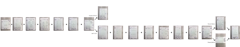
Sitemap
After our storyboards, we were charged with creating a sitemap for our product. The purpose of this step is to organize our functions in a logical way providing us with a reference to create prototypes and more. It helped us as a team clearly understand the information architecture of DressMe, and to give us an idea of how our app was going to be structured.
The previous two steps (Design Sketches and Storyboards) had given us a basis on how our app was going to be navigated, but at this step we were required to pin down the exact screens and steps each function required. In our main navigation bar we had five functions: Closet, Outfit, Home, Shopping, and Settings. From each function was multiple steps to help carry out our solutions to our personas' goals.

Paper Prototypes
After creating an entire sitemap of our system, our next step was to implement it into prototypes. To do this in a quick and effective way, we created prototypes on paper with Post-It notes to simulate an actual app. We wanted to focus on our three main functions (Managing Closet, Creating Outfits, and Shopping) in our prototypes to get the most valuable feedback from the usability testing.
From there, we were able to conduct eight usability tests from HCDE and non-HCDE students alike to get critique on our app. This step is crucial in the process because it allows us to see what features and buttons are needed on each interface, as well as invaluable user feedback about their experience. From the data we collected from the usability testing, we were able to refine our app's design and make improvements to the overall experience.
Evaluation of Findings
In the last few steps of the process, we had created a sitemap of our product's function which we used to create paper prototypes to conduct usability testing with. For the usability tests we administered all three tasks to the user, so they were able to get an insight into our app and provide feedback of the app as a whole. As the tests were underway, we took extensive notes on how the user went about the task, their critiques and comments, and any hesitation or question they had on the way. All of this data is important because it allows us to make changes in our product needed to create an overall better experience.
With the data we wrote up a report of our findings: what went well, what had need for improvement, and what needed to be taken out. Once the report was written, we were able to make a few design and function changes to better serve the user and their experience of DressMe.
Annotated Wireframes
With the findings from our evaluation, we were able to go into wireframes portion with a clear mind and a plan. Wireframes are low-fidelity mockups, using minimal color and plain design to convey the basic layout and functions of each screen. Using Axure for our project, we created wireframes for our entire system so we could visualize the flow from one screen to the next. Along with the wireframes we included annotations for interactions that were not immediately evident and rational for certain design decisions in DressMe. To display our whole system, we then created visual interface state transition diagrams for each major function in the system (i.e Manage Closet, Create Outfits).
We then had the opportunity to subject our wireframes to critique from our peers, where we used our annotations to justify certain designs and interactions in the system. Our reviewers gave us critical feedback on our system which we used to refine our design for the next step: high-fidelity mockups.

Hi-Fidelity Mockups
At this stage in the process, we had reworked and refined our whole system for DressMe. We had changed functions, and removed features to create a more elegant design and interaction for our target users. High-fidelity mockups are polished and refined screens that are used to represent screens of our application. Unlike wireframes, they include color, icons, and images to give the feel that it is from an actual product.
For our high-fidelity mockups, we created four screens that we believed to be the most valuable to our app (Home, View Closet, Generated Outfit, and Shopping) in Sketch. After another round of critiques in class with our peers, we incorporated their feedback into a final version of our design, editing our color scheme and creating a cleaner look. In this part, we were very focused on not creating our product for a specific gender, we wanted users of all genders and backgrounds to feel comfortable and at with DressMe. We also wanted to make sure the design was not obtrusive, our users would typically use our app first thing in the morning so we set out to create a pleasant experience. To accomplish this, our design is very clean, white background with grey icons, and our color we used to signify interactions was a mellow green, to give a calming feeling to the design.
Since our mirror is only used for visualization, it does not have a system, it is not interactive. To show what we were envisioning for this product, we created a mockup in Sketch, to be able to show what we were thinking of.